Some crappy pics of some of the new 2008 HHR colors...
#1
Some crappy pics of some of the new 2008 HHR colors...
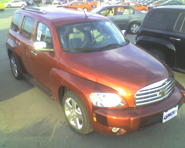
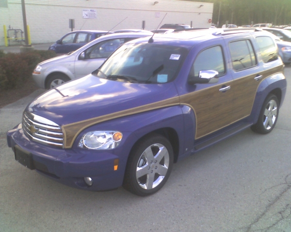
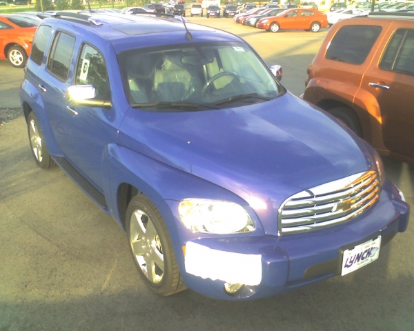
Here are some pictures I just took of some fresh off the truck HHR's with some new 2008 colors. (I'm sorry for the crappy quality; my cell phone was the only camera I had with me.) I have to say, even though the terrible picture doesn't do it justice, the Cardinal Red Metallic is absolutely STUNNING. It's sporty and classy at the same time. The heavy metallic finish just GLISTENS. Just my opinion, but I don't think there is a past or current color that comes close to how great this color is. I'm pretty pissed that I won't be able to get it on the HHR SS. The Blue Flash Metallic will absolutely be a love it or hate it color. It's really two colors; blue and purple depending on how the light hits it.
A 2008 HHR LT in Cardinal Red Metallic:
A 2008 HHR woody in Blue Flash Metallic:
A 2008 HHR LT in Blue Flash Metallic:
A 2008 HHR LT in Cardinal Red Metallic:

A 2008 HHR woody in Blue Flash Metallic:

A 2008 HHR LT in Blue Flash Metallic:

Last edited by misterjensen; 10-01-2007 at 08:41 AM.
#3
Again, the pictures really suck, but you can faintly see the purple glow to the right of the passenger side headlight in the last picture. It's much more pronounced when you see it in person.
#4
Now see...I see the difference in color from photo 1 and 2. I see more purple in the first and more blue in the second. Course My other half says I don't know $h#### (that's shucks) about colors anyhow.
But I do like it. Was thinking about that for my next car. But need to see it in person.
But I do like it. Was thinking about that for my next car. But need to see it in person.
#7
Unfortunately, when the primary purpose is to accurately depict color, it's all but impossible to do with any sort of reasonable accuracy without first jumping through a number of hoops to establish the correct white balance temperature (and no, I'm not just talking about picking one of the four or five settings offered on the camera). Essentially, those are for choosing the "least bad" estimate. They don't help select the correct one. (The best way is to include several reference color points (usually called "gray cards", "18% gray cards", "white cards") in a scene, and cropping them from the margins when processing later. (Some tricks would be to use a dummy license plate whose base color is an established reference color) If you REALLY want to ruin your day, shoot with mixed types of lightings. The color balance can vary across a single image. Ugh.
Then, even if you've done all your homework and duly addressed all of the technical and compositional issues, it still doesn't really deliver anything more than a close "guesstimate" without ALSO calibrating the medium that's going to be used to display it. Show the same image on a dozen different LCD's, and I can almost assure you a dozen different outcomes, and that would even include multiple LCD's of the same type. The same holds true for printers, projectors, and just about anythting else used to display an image.
At least in printed brochurces, you've got a reasonable expectation of accuracy because service bureaus are generally very good about color calibration, and they have access to the colorimeters needed to get something that's close to the original within a negligible margin of error. An ad hoc camera phone photo in combination with a laptop display is about the most impossible circumstance imaginable. That's NOT a slight against the picture taker; there's nothing even Helmut Newton himself could do.
That's why I'm SO glad there is still SUCH a demand for Black and White work. I spend damn near as much time post processing for proper color calibration, etc. as I do at a shooting location; and at least with Black and White, there's a WHOLE lot of latitude one can chalk up to "creative interpretation" when you don't have to worry about the nasty color spectrum thingy. :)
Thread
Thread Starter
Forum
Replies
Last Post


 ) are UGLY!
