
Have you noticed? Pepsi / Mountain Dew
 01-09-2009, 08:15 PM
#1
Senior Member
Thread Starter

Join Date: 08-20-2006
Location: Hillsdale, Michigan
Posts: 21,640
I don't drink either of these but besides the new Pepsi logo have you noticed that Moutain Dew is now called Mtn Dew. The cans look wierd.

Last edited by HillsdaleHHR; 01-09-2009 at 09:04 PM.


 01-09-2009, 09:13 PM
#6
Senior Member

Join Date: 06-19-2008
Location: Indiana
Posts: 1,454
man, glad the general consumer is noticing. I saw the new packages make their rounds through all of the design blogs a few months ago. The general consensus from the design community: horrible.
The new Pepsi logo is supposed to resemble a smile and each product offers a varying degree of how big the smile is. MTN DEW is now shortened and more extreme and sierra mist got an overhaul as well. My general opinion is: they now look like off brand.
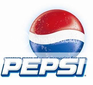
Also, thought you might like this image to go along with it. Which one do you like better the old classic logo, or the new butt crack....

you can see more of the new packaging here.
http://www.underconsideration.com/br...ew_bottles.php
The new Pepsi logo is supposed to resemble a smile and each product offers a varying degree of how big the smile is. MTN DEW is now shortened and more extreme and sierra mist got an overhaul as well. My general opinion is: they now look like off brand.
Also, thought you might like this image to go along with it. Which one do you like better the old classic logo, or the new butt crack....
you can see more of the new packaging here.
http://www.underconsideration.com/br...ew_bottles.php
 01-09-2009, 09:31 PM
#8
Senior Member

Join Date: 09-06-2006
Location: St. Louis, MO
Posts: 1,222
I noticed it a few weeks ago on a stack of Pepsi 24 pack cases in front of a local QuickTrip.
Last night on the news, there was a story about it. They basically said that the marketing department of Pepsi decided to change the logo and the "white swoosh" in the logo to look more like the new Barrak Obama logo used in his recent campaign for presidency hoping that it would increase the market segment of Pepsi. Not sure how much truth is behind it but it was a national news cable channel that I saw the story on. Guess they are trying to ride on the recent "change" popularity of the Obama theme.

If you do a search on the internet for Obama Pepsi Logos you will find hundreds of comparison of the two.
I personally think the new Pepsi off center white band was a bad choise and looks goofy. I liked the original.
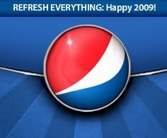
OLD PEPSI LOGO
NEW PEPSI LOGO

Last night on the news, there was a story about it. They basically said that the marketing department of Pepsi decided to change the logo and the "white swoosh" in the logo to look more like the new Barrak Obama logo used in his recent campaign for presidency hoping that it would increase the market segment of Pepsi. Not sure how much truth is behind it but it was a national news cable channel that I saw the story on. Guess they are trying to ride on the recent "change" popularity of the Obama theme.
If you do a search on the internet for Obama Pepsi Logos you will find hundreds of comparison of the two.
I personally think the new Pepsi off center white band was a bad choise and looks goofy. I liked the original.
OLD PEPSI LOGO
NEW PEPSI LOGO
 01-09-2009, 10:19 PM
#10
Senior Member
Join Date: 06-19-2008
Location: Indiana
Posts: 1,454
i highly doubt it had anything to do with obama. If pepsi's marketing team and designers really did they they would truly be idiots.
Has to be much more reason to change a classic logo. Coke has done it a few times, and they've done it well. However Pepsi really shot a blank on this one. It wouldn't be as bad if they just redid the logos but the packaging is horrible. They're trying to do the minimalism route and failing at it.
Has to be much more reason to change a classic logo. Coke has done it a few times, and they've done it well. However Pepsi really shot a blank on this one. It wouldn't be as bad if they just redid the logos but the packaging is horrible. They're trying to do the minimalism route and failing at it.